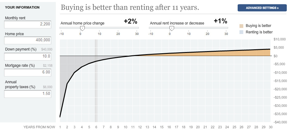
I love interactive maps and calculators and there’s almost nothing I love watching more than the Rent vs. Buy data from quarter to quarter. Trulia leads the way in collecting this data and offering it in an easy to read interactive, but a great way to get a more personal reflection of whether renting or buying is a better option, or when it will come a better option than renting is through the New York Times Calculator below. Based on my own personal information for the city I currently live in, renting is the better choice for up to 11 years – after that buying is a better option.
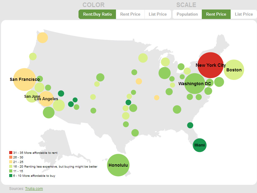
However, according to this past quarter’s Trulia data, buying is a better option in most large metros. Trulia identifies affordability based on a particular methodology that you can read about here, but basically a score of 14 or lower means it’s more affordable to buy a property than rent. Anything above a 15, and it’s usually better to rent than to buy.
This year’s Trulia data (in the above image) does not go into detail on prices, unlike the 2011 data which included average rental and purchase prices, as well as data on unemployment and job growth. (I wonder if the launch of their mortgage center has anything to do with this? Hmm….)
But if you go to the Trulia blog, they have previous quarters analyzed in more detail like the July 2011 map -a score of 13 to 18 is still cheaper to rent, but buying might be a better option. A score below 14 is a good indicator of buying might be a better option.
This map and data can be used for prospective and current homeowners, as well as people looking to get into the rental business; if you can afford properties in areas where it might be better to rent or it’s a wash, you may make a killing on rental income over the next few years.
As one who would like to purchase property sometime in the near future and is willing to move, it’s also a great way for me to narrow down cities I’ve already been eying.
Are you looking to purchase a property soon?


